Responsive web
Statistically, there are 1-2 mobile devices per inhabitant of our globe. In the future, this factor can only grow. Presently,
the creators and owners of websites are forced not only to present possibility to use the web conveniently on tablets and smartphones
but also to make it the core of the development.
In this case, convenience means the ease to access the information by the client, what shifts into reaching a larger number of receivers
and increases brand recognition. It is worth mentioning that it remains a great impact on the perception of the brand as modern
and reaching the spirit of the time.
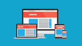
As there is a great variety of devices on which it is possible to browse web sites, it would be prudent to create a system of content for all of them
– it would not be practical for web visitors. However, creating and maintenance of two (or more) versions of the service, each of which is dedicated
to a different type of device entails unnecessary costs.
Responsive Web Design
According to the facts listed above, there has been a paradigm spawned in recent years on web designed which leads to websites that the respond automatically
on the type of screen they are displayed and it is called from English a Responsive Web Design (RWD).
Responsive Web Design means that websites should adapt to the device in a way it requires a little user action (such as scroll, zoom in and out).
Website elements change its location to fit the width of the screen (browser) so that they fill properly the screen. Tools for creating such sites
are provided by the HTML5 and CSS3 technology.
Benefits of Responsive Webs
The biggest advantage of the RWD is that a well-designed website displays properly regardless of the browser or/and device used. It is worth mentioning
that in case of mobile devices the user has no possibility to use a precise cursor as in the case when using a computer mouse or trackpad (touchpad),
what is also taken into account when designing the RWD interface.
The idea of creating the user-friendly websites is also supported by another but still very important fact; Google introduced huge changes into its search
algorithm on April 21, 2015, which means that pages unsuitable for mobile devices go further in the search results page. This also results in smaller number
of page visits and eventually loss of potential customers. So, it is like having a card up in sleeve and a unique opportunity to stay ahead of the competition
and get easier to customers.
Offer
We offer you our experience in this field and encourage contacting us to discuss the order. We enable both the Responsive Web Design as well as adjusting
and existing one. Of course, if desired solutions are unusual or/and beyond the technical capabilities of web browsers (e.g. integration with
the device calendar or use of sensors) we can also create a mobile application on the selected platform (Windows Phone or Android)